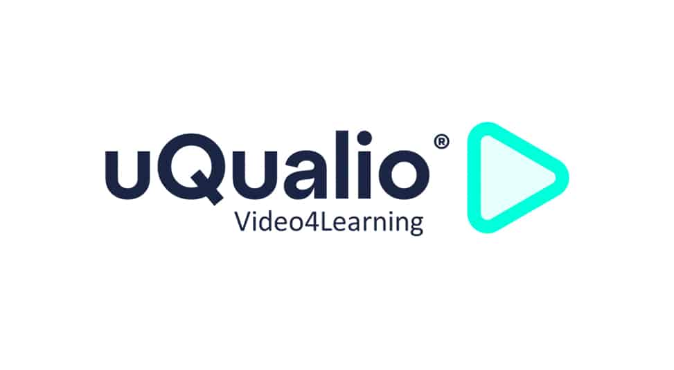
We are super happy to present to you the updated version of uQualio’s logo.
In the life of every company, there comes a moment when you need to look closer at how you look and how that matches what you want to be.
It has been almost 5 years since we started working on making the best video eLearning platform uQualio.
We realized some time ago that our current brand identity needs an update. We have worked intensly to update our visual identity to reflect newer design trends, and to make it visible to everybody that we intend to become the world’s preferred video eLearning platform.
Goodbye to our previous logo
Our professional profile and company have grown and evolved over the last years, and now it is time to adapt. Our old logo did a really great job for our beginnings, but the time has come to move on. We have altered our logo to reflect who we are today and to symbolize our dynamic future.
After a lot of creativity sessions, we have chosen to keep the text from the old logo, to represent that we, for now, stay true to our legacy. In the new modern logo, we have updated the colors, and added the play symbol as a key element, which symbolizes what our platform is made for, and our orientation for growth, while remaining true to our longstanding reputation. We feel that we this way have kept the essentials but show that we keep up with the current pace of technology evolution.
The Play Arrow Icon in the logo
The “Play” arrow was first seen around 1963 on portable Philips and Grundig machines, probably designed by Swedish engineer Philip Olsson. The play arrow was first designed to indicate the direction a tape would go when reading on the reel-to-reel tape players. Even though we have switched from cassettes to CDs, VHS to online streaming, the media controls icons remain the same
The “Play” arrow — a triangle pointing to the right — is possibly the most ubiquitous modern technology symbol there is.
The shape is perfect for communicating playing a video, as you do on the uQualio video eLearning platform, but for us, it also signalizes the way forwards that we as a company are on the path to take.
New corporate website
Along with announcing our new brand identity, we can also reveal that we will soon be launching our corporate website with new layouts. The new site will deliver richer new content in a modern, clean, and organized layout to provide visitors and potential customers with easy access to our solution information, highlighting what we can be used for, and what the benefits are.
The new logo and brand identity will reflect the bold, energetic, and forward-looking culture of our company, and are designed to inspire and further elevate us as we continue to provide a disrupting new way of making video eLearning easy and accessible for our current and upcoming customers.
Updated colors & UX on the uQualio platform
As some of you might already have noticed we have already started changing the visuals on the video eLearning platform.
This will continue so the platform ends up matching the updated visual identity, incl. logo, fonts, and colors.
Furthermore, we have had a UX designer run through several elements of the platform and the onboarding. We are currently working on making these ready for you so that the UX design is even easier to use.
We hope you receive all these changes well! If you experience any problems please let us know.
Achieve Effective & Affordable Video Training
– uQualio is an award-winning, easy-to-use, all-in-one NextGen LMS software for any types of online video training.


